PROJECTS
PROJECTS
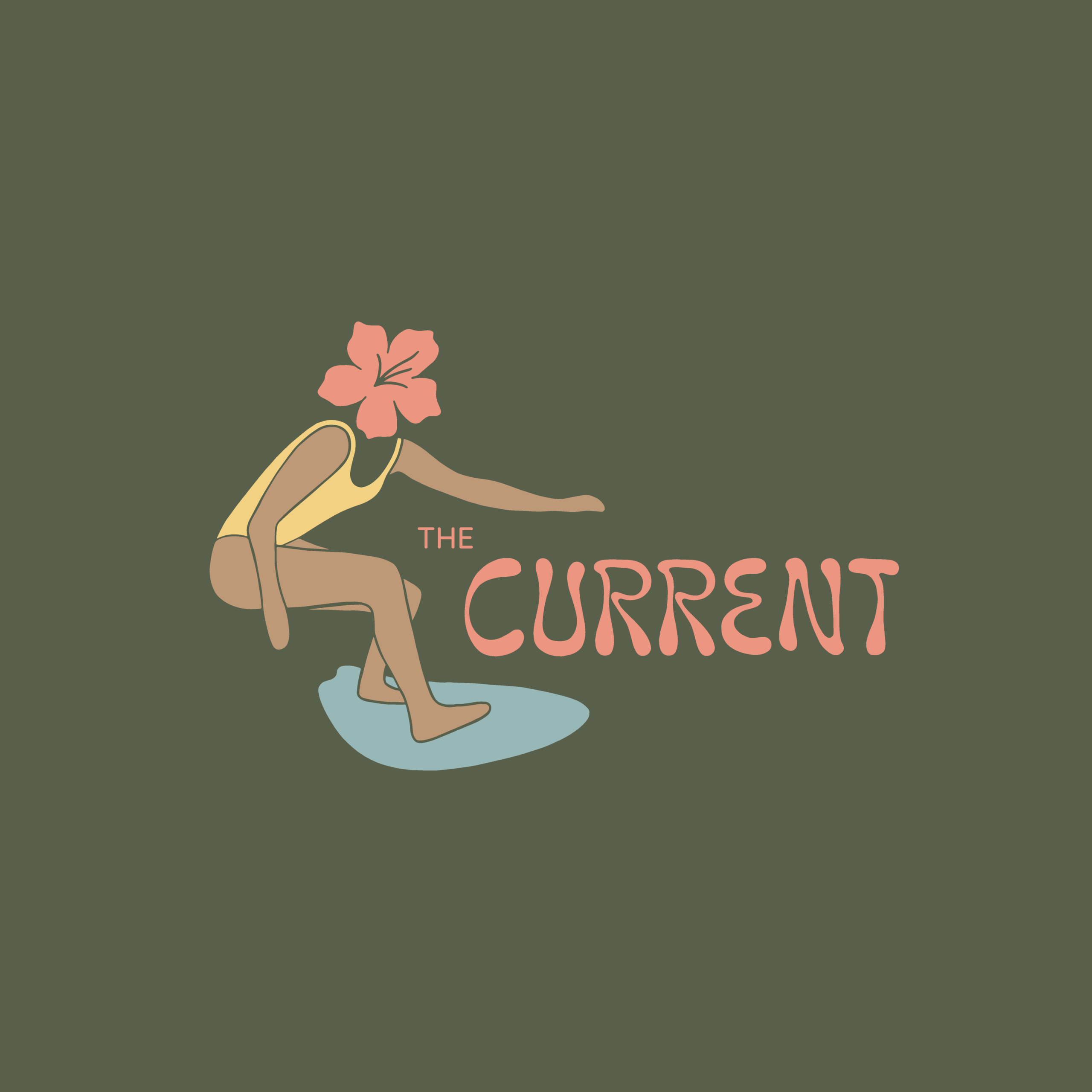
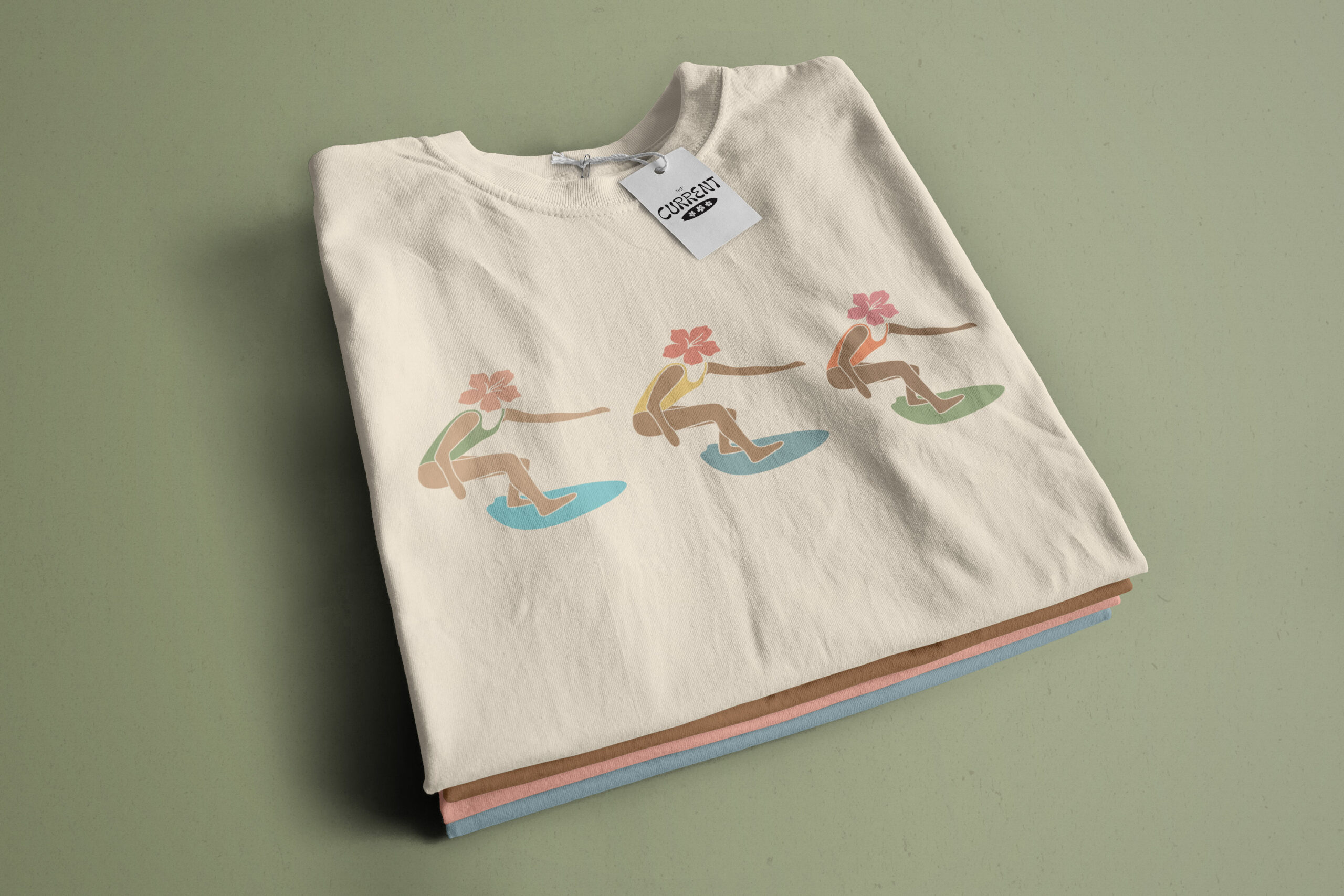
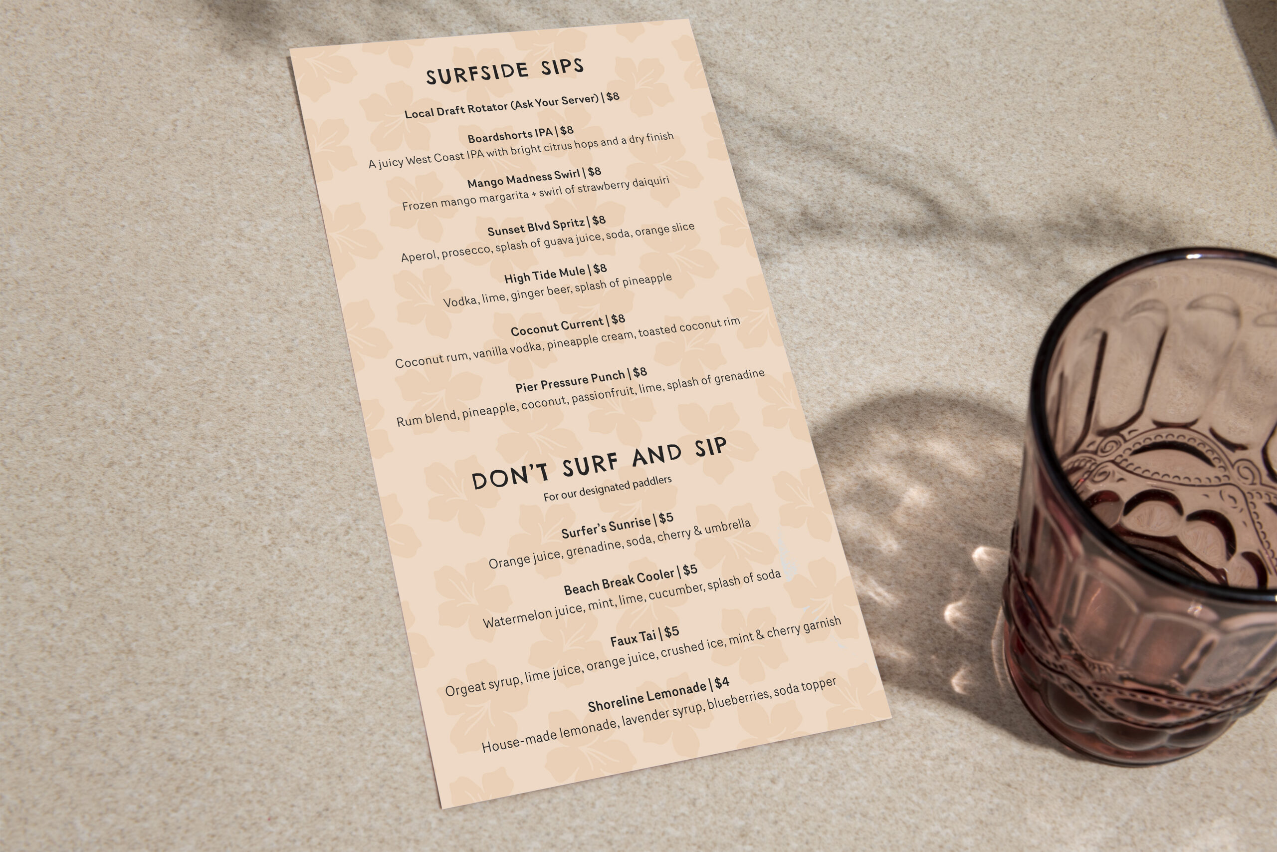
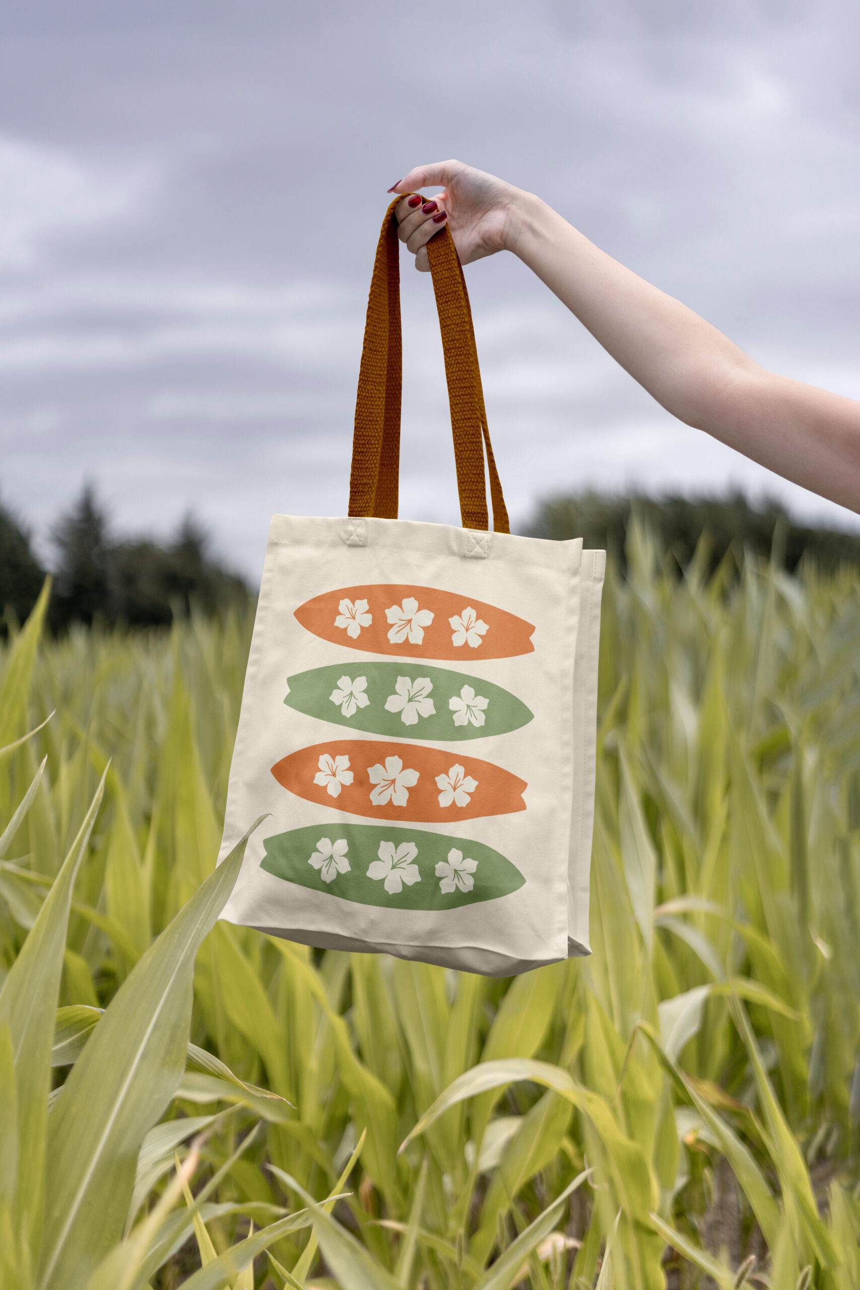
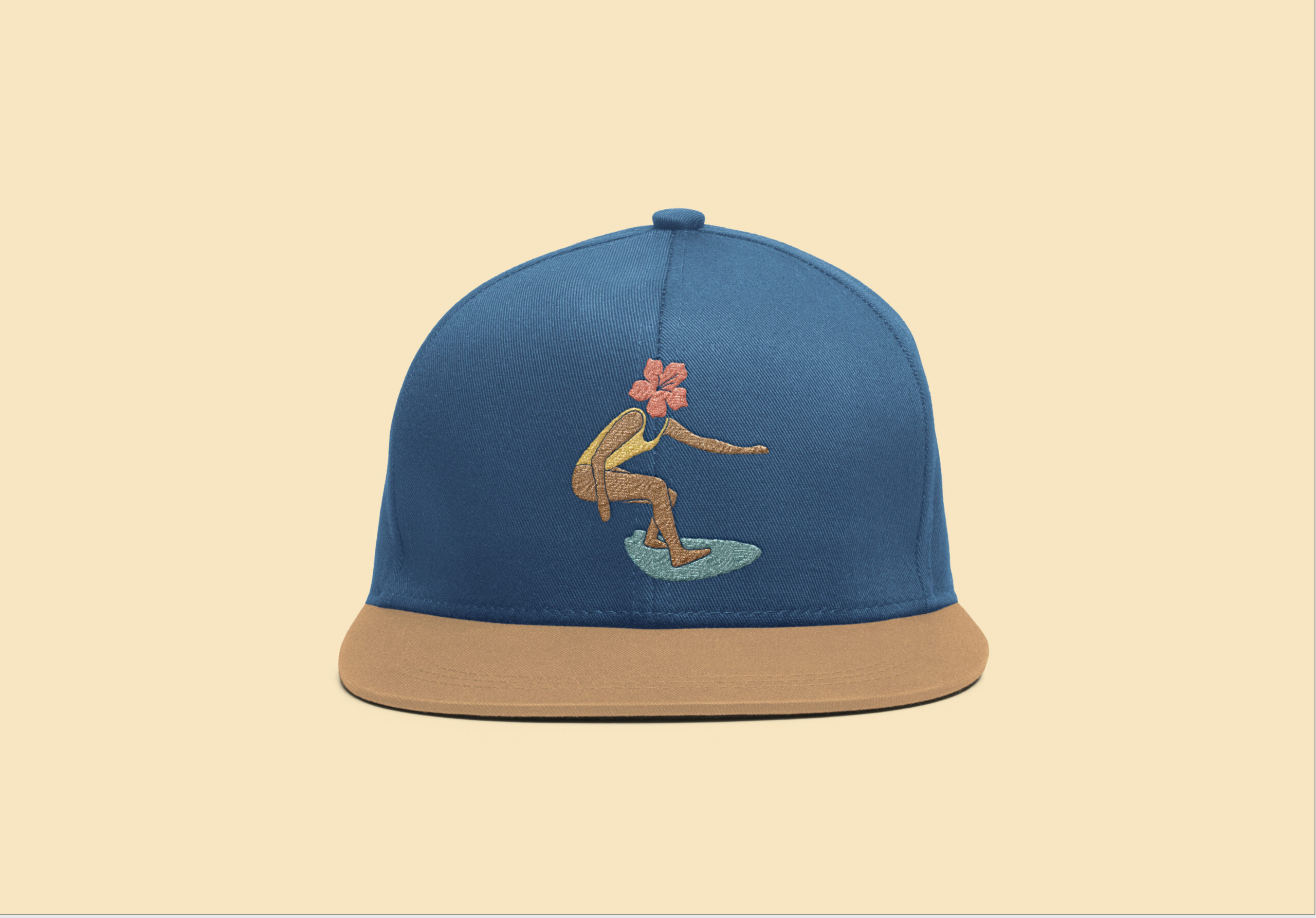
The Current is a fictional vintage surfer-style restaurant set on a dock, created for a branding class project. The goal was to build a complete brand identity with a dynamic logo and a muted, sun-bleached color palette to shape the audience’s experience. The project also included designing physical elements such as a menu and sticker pack to make the branding both functional and fun.

The Current is a fictional vintage surfer-style restaurant set on a dock, created for a branding class project. The goal was to build a complete brand identity with a dynamic logo and a muted, sun-bleached color palette to shape the audience’s experience. The project also included designing physical elements such as a menu and sticker pack to make the branding both functional and fun.
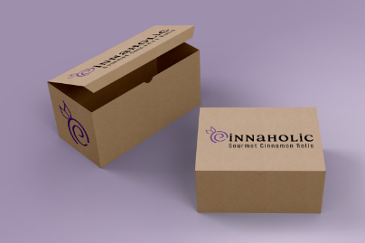
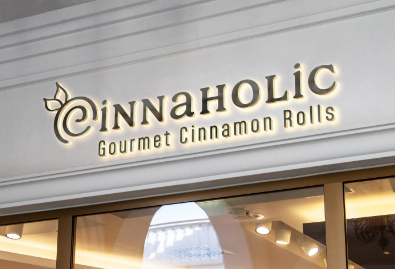
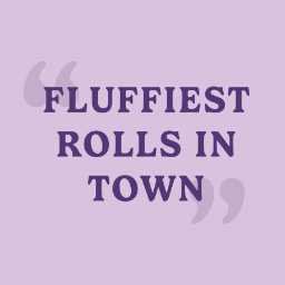
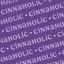

For this branding project, I redesigned a logo that I felt didn’t align with its brand. The new logo reflects the classic cinnamon bun swirl while also incorporating elements that highlight the company’s vegan identity, making it more effective for advertising and marketing.

For this branding project, I redesigned a logo that I felt didn’t align with its brand. The new logo reflects the classic cinnamon bun swirl while also incorporating elements that highlight the company’s vegan identity, making it more effective for advertising and marketing.
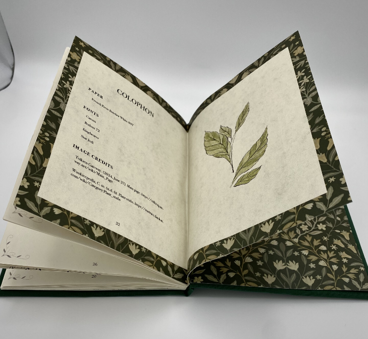


The Botanical Guide to Fantasy Realms is a chapbook I created for my junior year. It explores different mythical plants from fantasy universes. Every plant in the book is illustrated by me. I created it with a butterfly binding technique, and the cover is made with green linen fabric wrapped around board and gold heat transfer vinyl.
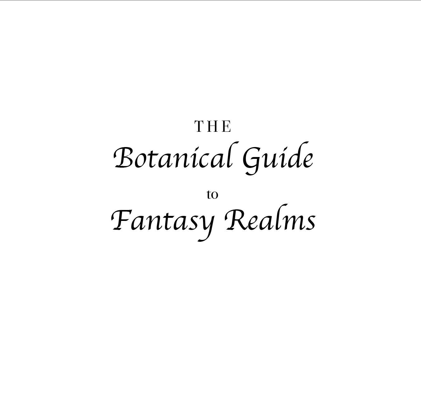
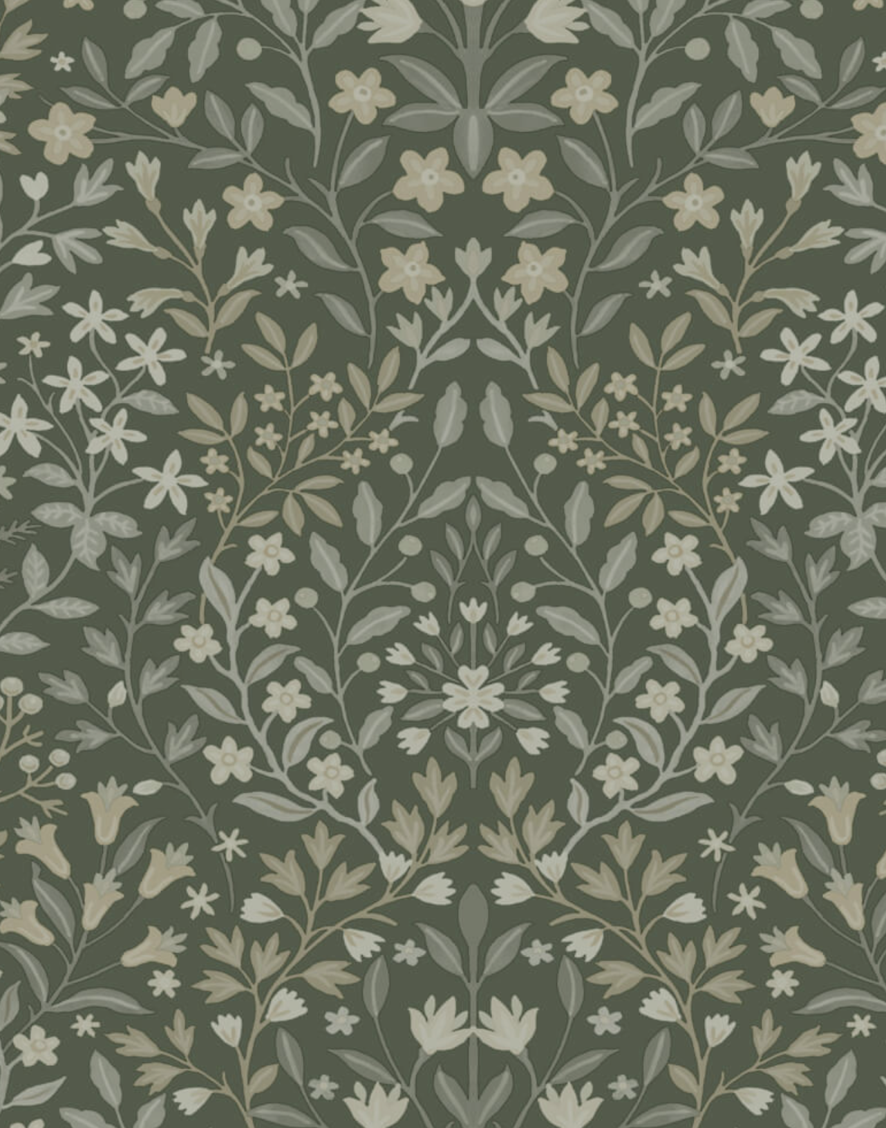
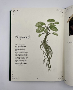
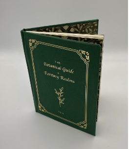
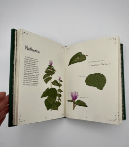
The Botanical Guide to Fantasy Realms is a chapbook I created for my junior year. It explores different mythical plants from fantasy universes. Every plant in the book is illustrated by me. I created it with a butterfly binding technique, and the cover is made with green linen fabric wrapped around board and gold heat transfer vinyl.

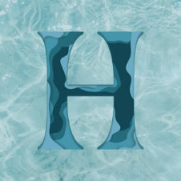

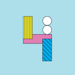


This poster was created for 36 days of type my junior. The two main requirements for this project were that I had to incorporate a different type style every day and they had to be a mix of analog and digital.
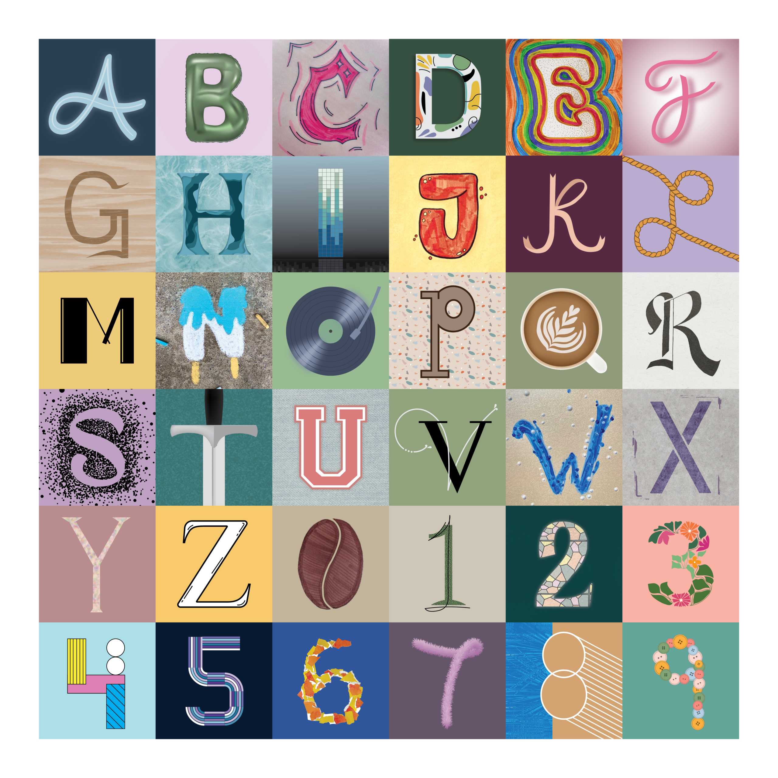
This poster was created for 36 days of type my junior. The two main requirements for this project were that I had to incorporate a different type style every day and they had to be a mix of analog and digital.
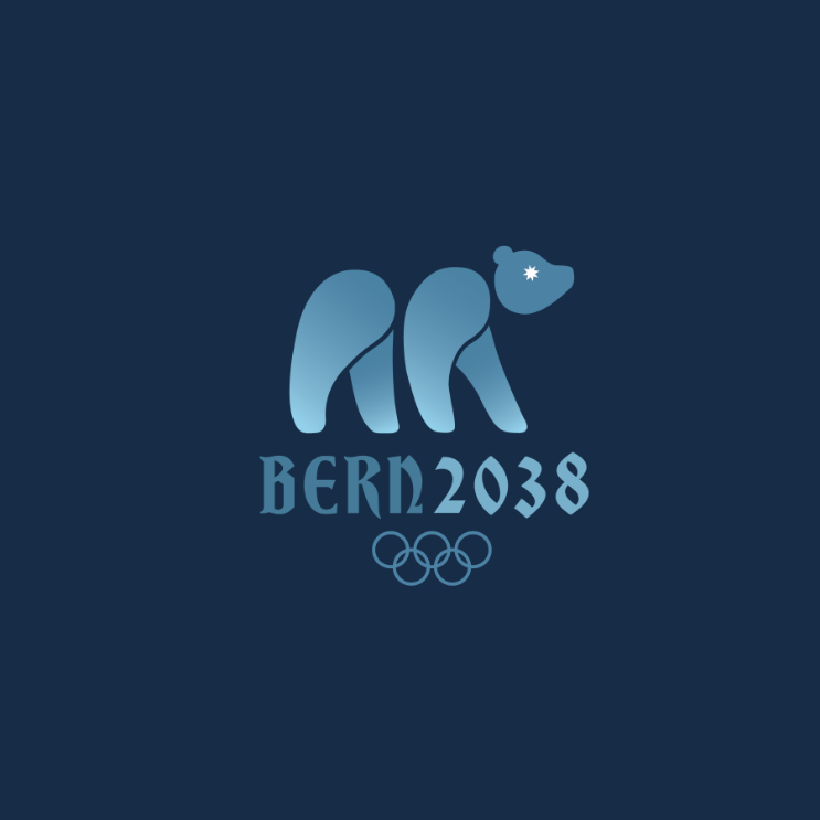
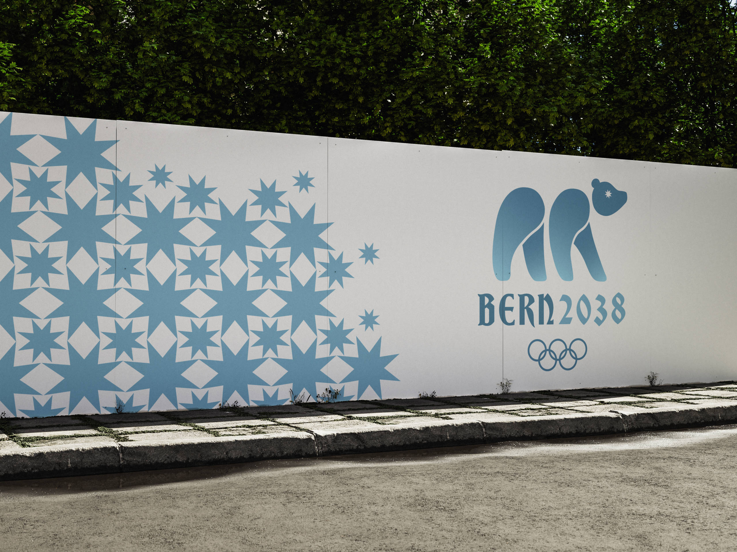
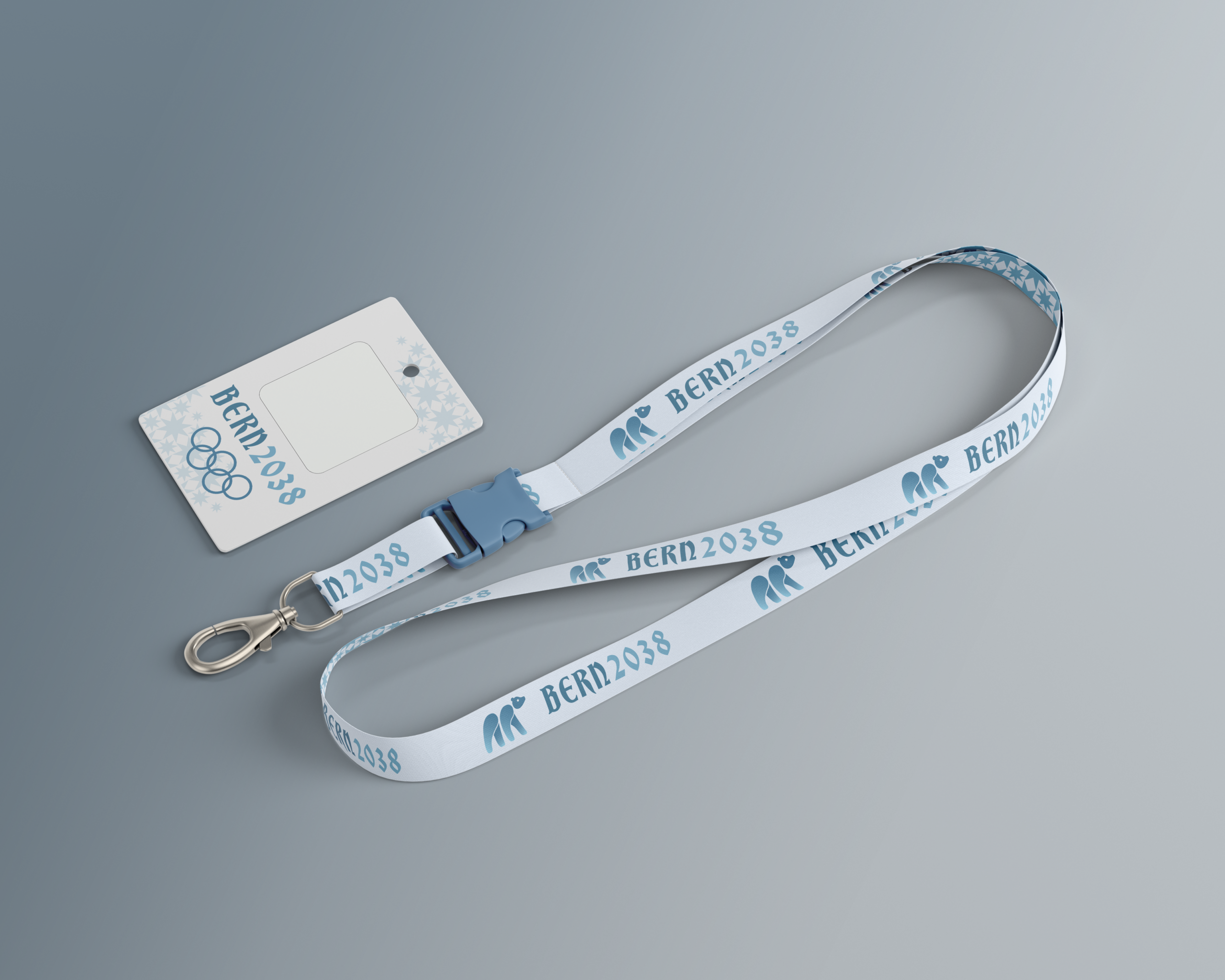
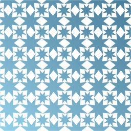
The project focused on creating an Olympic bid logo for a city that has never hosted the games, and I was assigned Bern, Switzerland for the 2038 Winter Olympics. After extensive sketching and research, I based the design off a bear to reflect Bern’s culture identity. I used icy blue tones to evoke winter and also wanted to avoid Switzerlands traditional red and white.
The project focused on creating an Olympic bid logo for a city that has never hosted the games, and I was assigned Bern, Switzerland for the 2038 Winter Olympics. After extensive sketching and research, I based the design off a bear to reflect Bern’s culture identity. I used icy blue tones to evoke winter and also wanted to avoid Switzerlands traditional red and white.
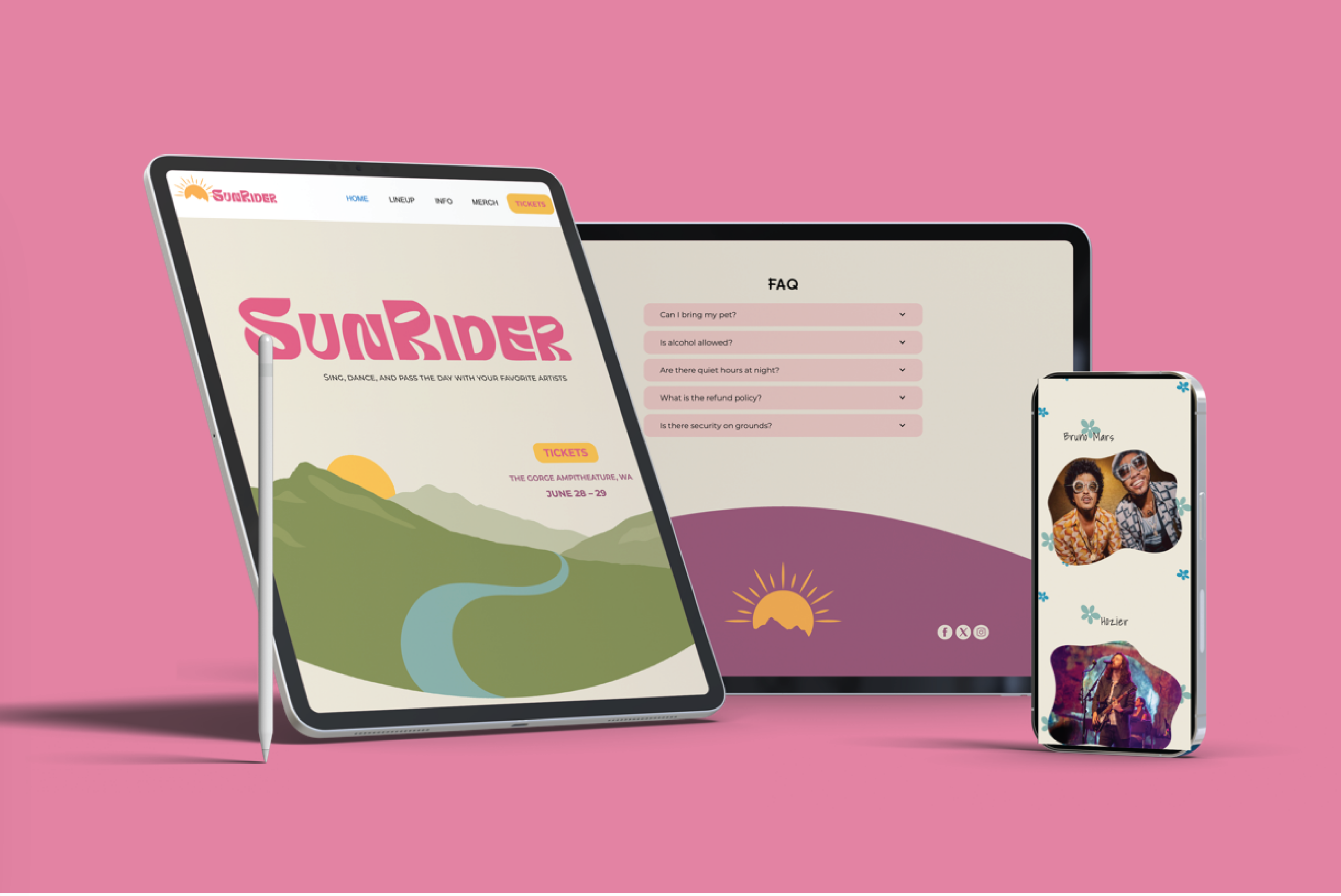
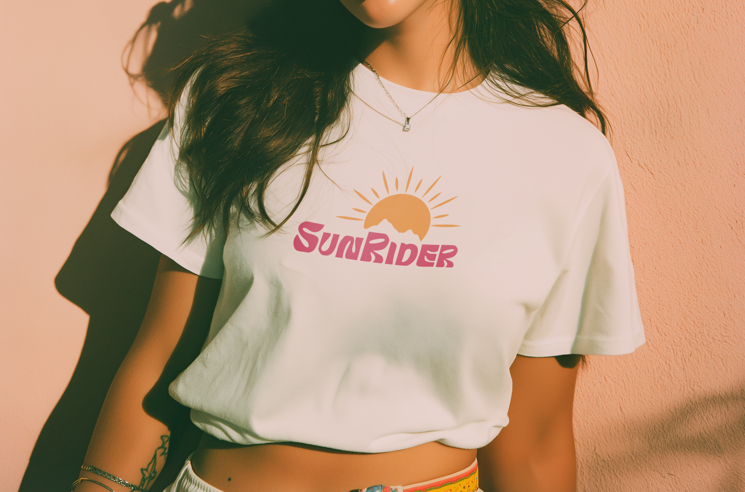
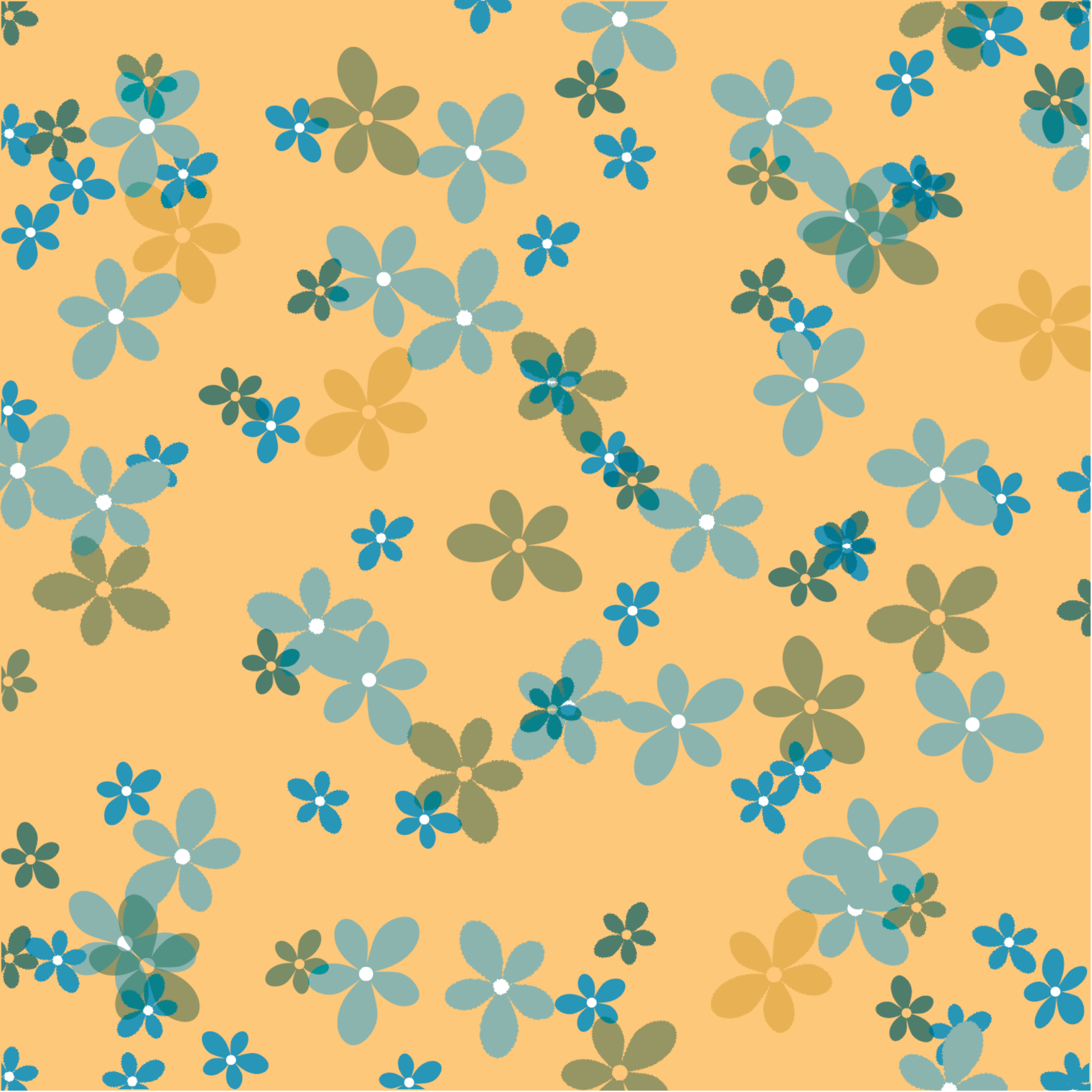
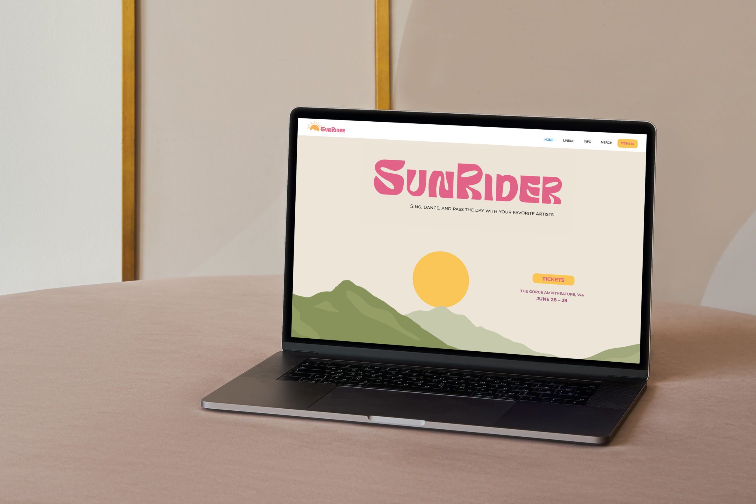
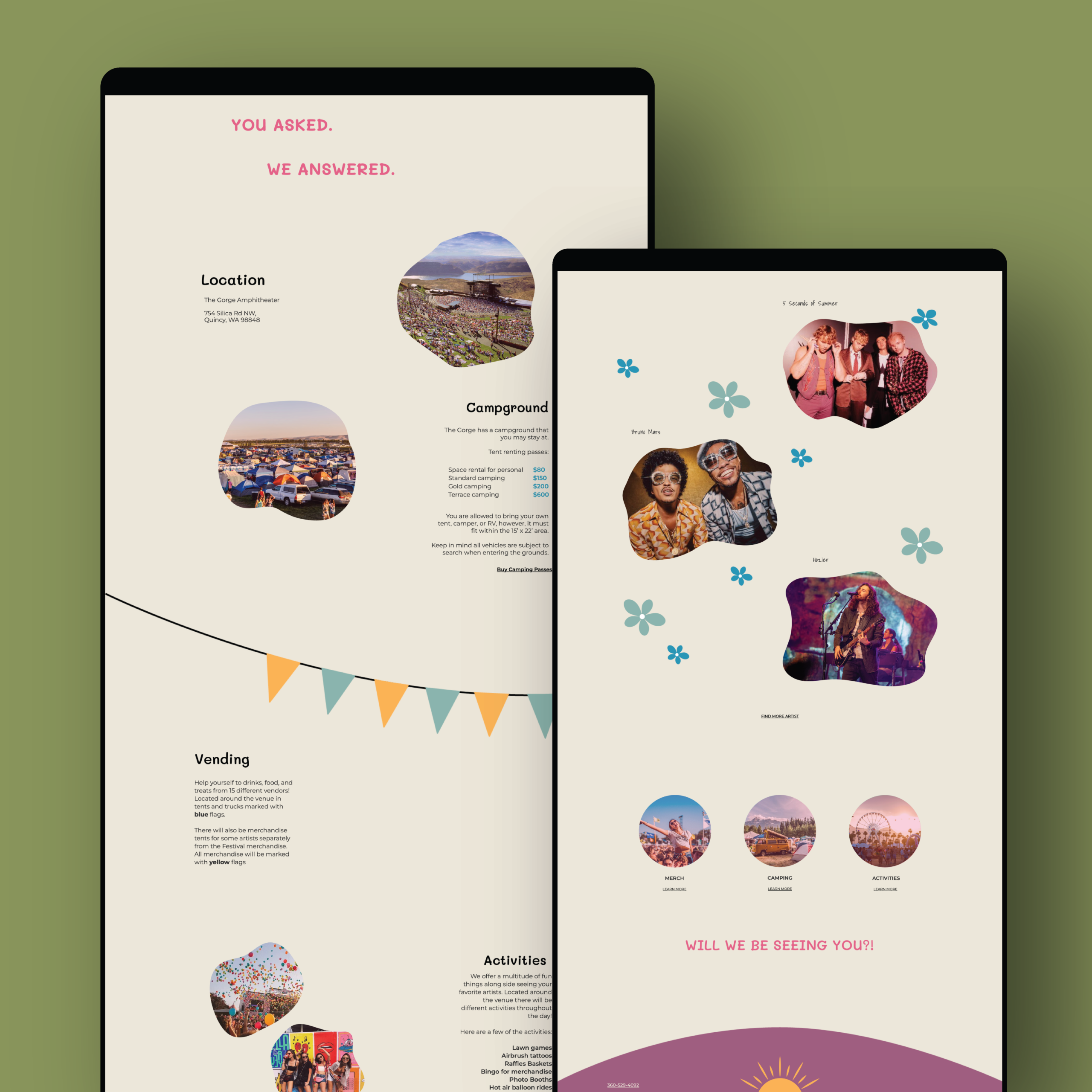
SunRider is a campground music festival I created for my web design class. This was the first website I ever made, but I think it’s a great stepping stone into web work and love to see how far I’ve come since then. All elements are creating to give a groovy and vibrant feeling. I took inspiration from festivals such as Coachella and Woodstock.
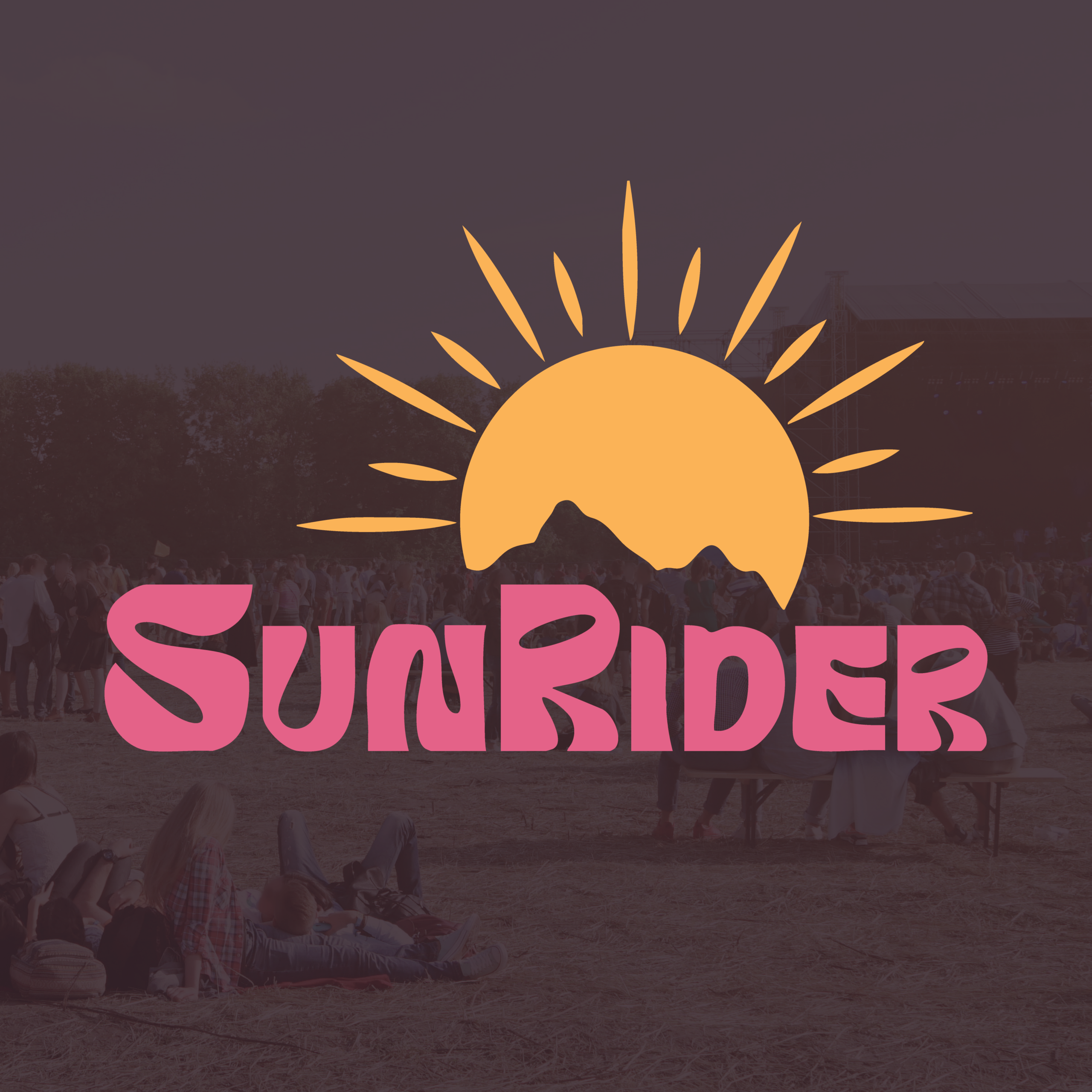
SunRider is a campground music festival I created for my web design class. This was the first website I ever made, but I think it’s a great stepping stone into web work and love to see how far I’ve come since then. All elements are creating to give a groovy and vibrant feeling. I took inspiration from festivals such as Coachella and Woodstock.
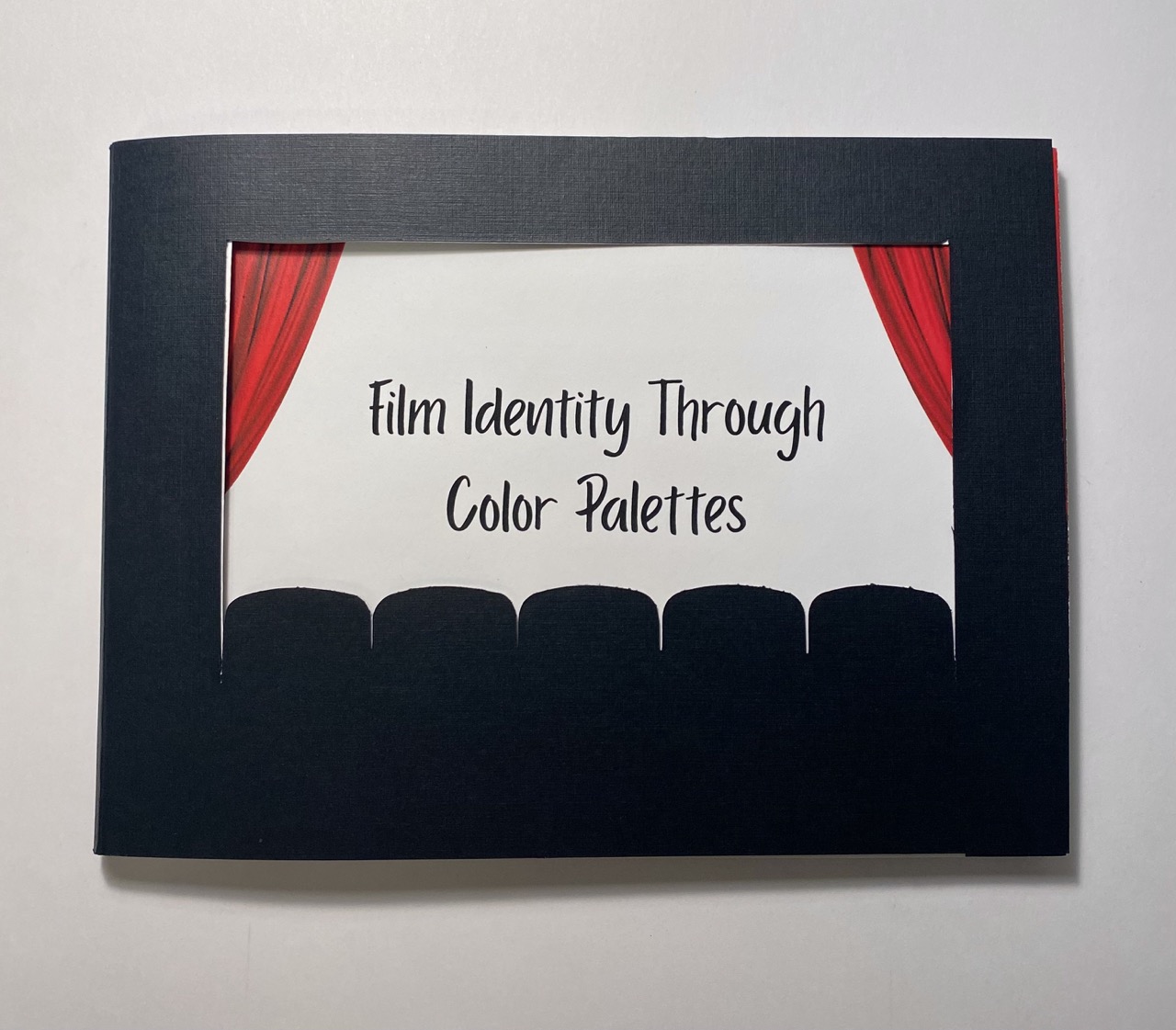

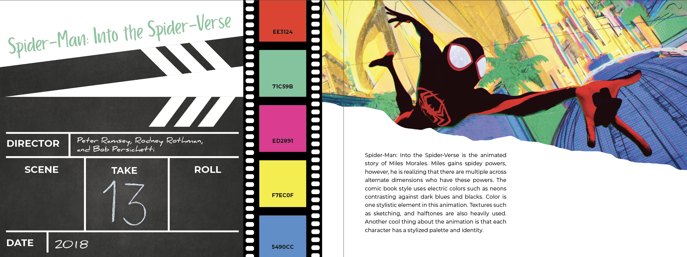
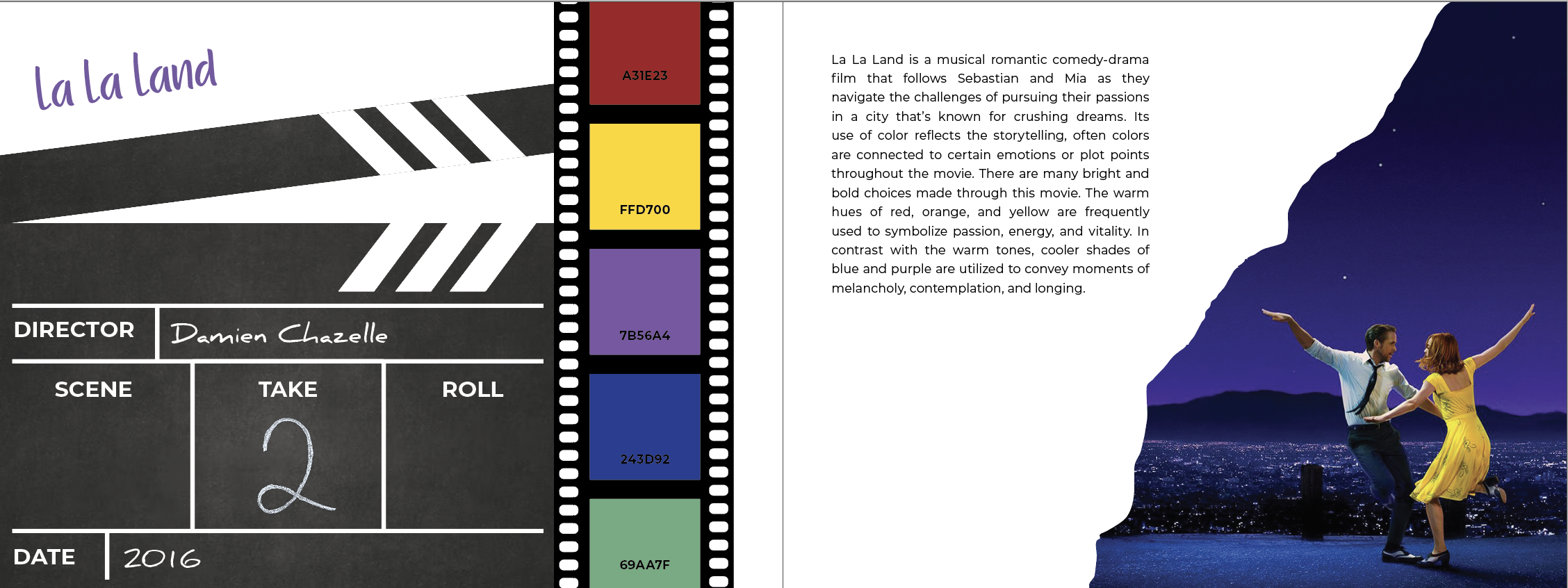
This publisher explores the idea of how color heavily contributes to a films identity and how it affects the overall feeling within each movie. The one required element for this project is I had to number the page spreads in a creative way.

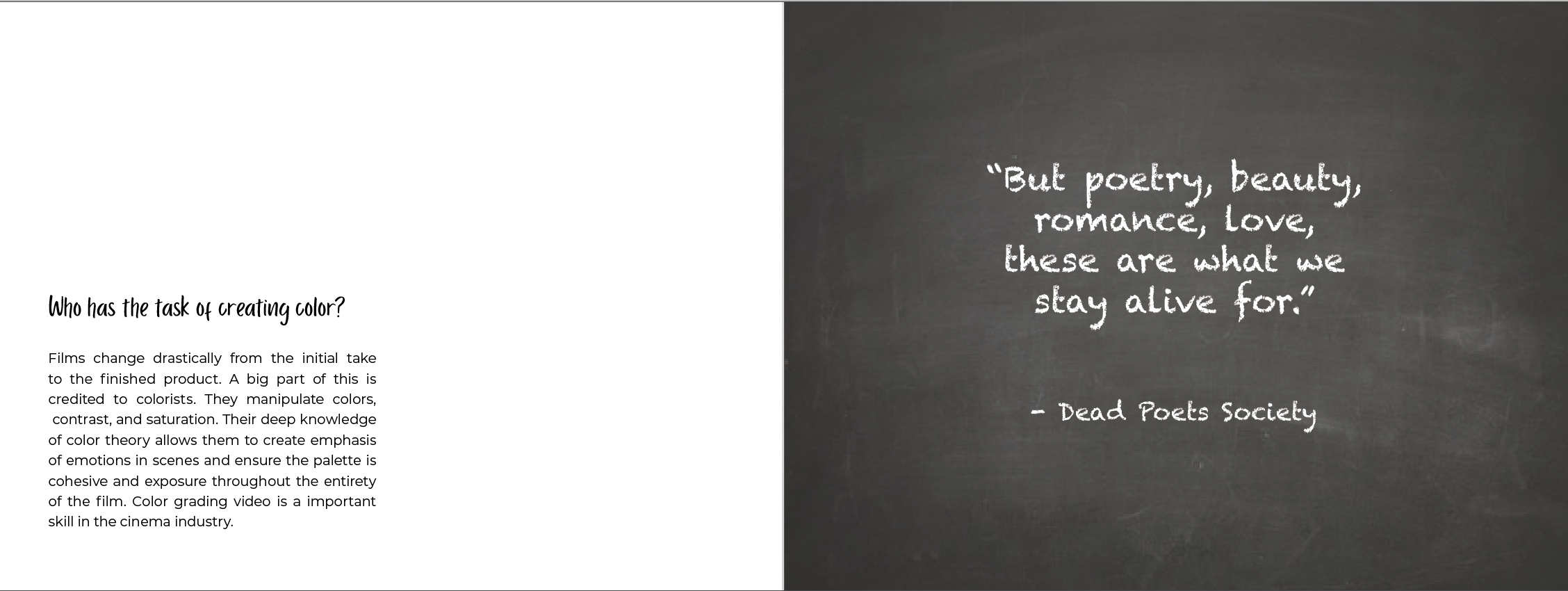
This publisher explores the idea of how color heavily contributes to a films identity and how it affects the overall feeling within each movie. The one required element for this project is I had to number the page spreads in a creative way.